Terra Nova is positioned at the intersection of nutrition, sustainability, and premium quality. We provide eco-friendly, flavorful, and nutritious products to revolutionize the food industry. Our target audience comprises health-conscious adults who value sustainability and quality. These urban dwellers appreciate the convenience and nutrition Terra Nova provides.
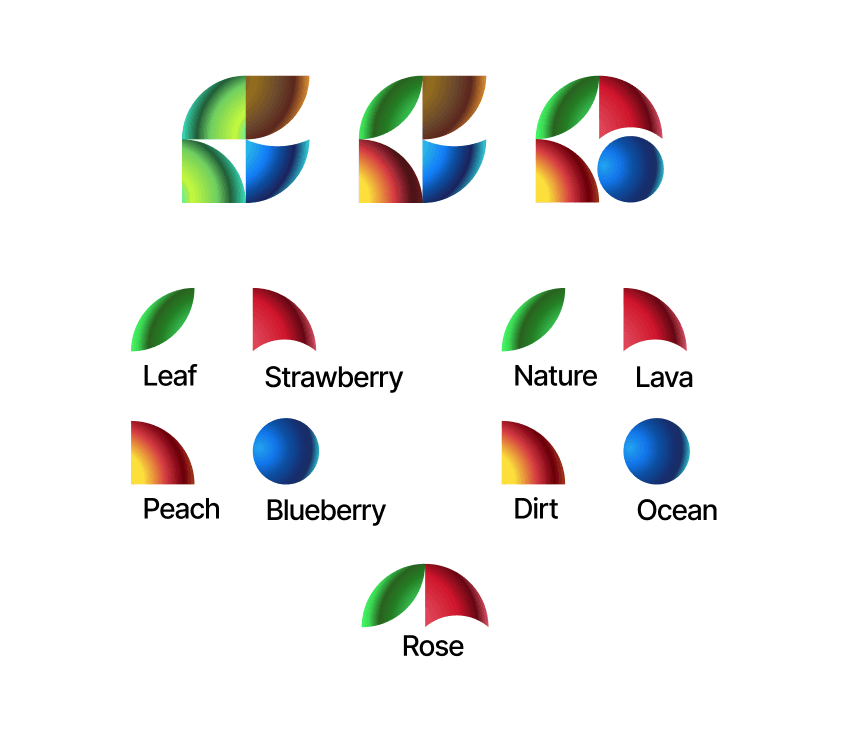
Our brand is anchored in sustainability, quality, health & wellness, and innovation. We believe in preserving our planet and ensuring future generations' wellbeing. We strive to deliver the highest quality in our products and services, with our customers' health and satisfaction as our priority. We're dedicated to making nutritious, wholesome food easily accessible. Our logo represents these values - the leaf signifies sustainability, the fruits symbolize freshness and health, and together, they form a rose, symbolizing harmony with nature.
Colours

Primary: #0EB733 - This vibrant green color immediately brings to mind the freshness and vitality of nature, mirroring Terra Nova's focus on natural, healthful products. Green is often associated with growth, renewal, and balance, further echoing the brand's dedication to sustainability and wellness.
Secondary: #000000 - Black serves as a strong, contrasting secondary color. It denotes strength and sophistication, underscoring the premium quality of Terra Nova's offerings. Additionally, black is versatile and timeless, ensuring the brand's visual identity remains modern and flexible.
White - White is often associated with purity, simplicity, and cleanliness, which aligns perfectly with Terra Nova's commitment to providing unadulterated, wholesome foods. It also provides a clean backdrop, allowing the other colors to stand out.
Accent: #DD414D - This lively reddish-pink color is used for emphasis and to draw attention to key elements. It adds a vibrant, energetic punch to Terra Nova's identity, and subtly hints at the fresh, flavorful fruits that are central to the brand's product range.
Typography

Inter is a versatile, modern, and friendly sans-serif typeface. It was specifically designed to work well on screens but also maintains its clarity and legibility in print. This makes it an excellent choice for Terra Nova, a brand that needs to communicate clearly and effectively across various platforms.
Inter Light provides a clean, minimalist aesthetic that aligns well with the brand's commitment to simplicity and purity. It's ideal for body text where readability is crucial.
Inter Medium strikes a balance between light and bold, making it excellent for subheadings and smaller headlines where you want to catch the reader's attention without overpowering the page.
Inter Medium Italic is the perfect choice for emphasizing specific words or phrases in your text. The italic style suggests a sense of motion, making it feel slightly more dynamic.
Overall, the Inter typeface family conveys a sense of modern professionalism, friendliness, and approachability, reflecting Terra Nova's mission to be a trusted partner in its customers' health and sustainability journeys.
Logo

The Terra Nova logo was meticulously designed to encompass the brand's fundamental values of health, sustainability, and unity with nature.
At first glance, the logo appears as a collection of four different shapes, each symbolizing a different aspect of the brand. The green leaf embodies our commitment to sustainability and the environment. The peach-like shape, painted in a vibrant yellow, signifies the natural, fresh ingredients we use in our products. The semi-circle resembling a strawberry and the circle akin to a blueberry, respectively in red-pink and deep blue hues, together represent the wide variety of nutrient-rich fruits integral to our offerings.
Beyond individual elements, the composite logo forms an abstract image of a rose, symbolizing the beauty and harmony found in nature, which Terra Nova aims to preserve. Simultaneously, it hints at the elements of earth, ocean, and nature, subtly aligning with our brand name, Terra Nova, which translates to 'New Earth'.
This multi-layered approach in our logo design reflects our belief that every component of our business, from ingredients to operations, holds its own significance while collectively contributing to our larger mission: to foster a healthier planet and populace through sustainable, high-quality nutrition.

Variations:


Note:
Terra Nova is a fictitious company created as a part of a class assignment.
Nikola Lubura retains all rights.
