Project Overview
A conceptual branding project creating a comprehensive visual identity for a fictional union of the Long Island Herald newspaper. The design system balances journalistic authority with labor union values through thoughtful symbolism and typography.
Design Elements
Logo Design & Symbolism
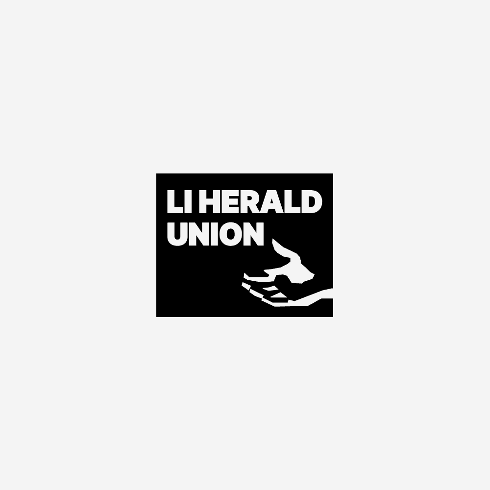
Created a distinctive emblem featuring a stylized hand holding/protecting a newspaper-reading dog, symbolizing:
Protection and support (the cupped hand)
Vigilance and loyalty (the alert dog)
Connection to print media (the segmented paper-like elements)
Developed multiple lockup variations for different applications
Established a strong two-color palette of bold cyan and black
Typography
Selected a robust type system including:
Inter Black/Bold for strong headlines
EB Garmond Extra Bold for traditional editorial gravitas
Balanced modern and classical typefaces to reflect both heritage and progress
Color Variations
Created a flexible color system with multiple treatments:
Primary cyan version for standard applications
Black and white version for formal documents
Grayscale version for secondary uses
Reversed white version for dark backgrounds
Brand Architecture
Designed multiple lockup configurations:
Full name: "Long Island Herald Union"
Abbreviated: "LI Herald Union"
Symbol-only version for icon applications
Circular badge version for formal applications
This conceptual project demonstrates the ability to create a cohesive brand system that communicates strength and unity while maintaining connection to traditional journalism values.


These logo mock-ups were created by Nikola Lubura.
All rights reserved. © 2024.
Herald Community Newspapers and LIHERALD.com are trademarks of Richner Communications.
